
When it comes to building or redesigning your school district website, looking at successful examples can help guide your decisions. Whether you’re in the early stages of planning or narrowing down potential website providers, evaluating websites that “get it right” is a critical part of the process.
To save you time, we’ve compiled a list of the top 10 school district websites that combine great design, user experience, and functionality. These examples offer valuable insights into what makes a school website not just aesthetically pleasing, but a key tool for engaging families, students, and the community.
How We Chose These Top 10 Websites
Creating a standout school website means avoiding common pitfalls like poor mobile design or overwhelming navigation menus. Our top 10 school district websites avoid these issues by prioritizing simplicity, clear navigation, and user-focused content. Key elements we considered include:
• Clean, well-organized navigation
• Consistent branding across the site
• Responsive design for mobile and desktop
• Use of multimedia, such as videos
• Social media integration
These features create a user-friendly, engaging website experience that draws visitors in and keeps them coming back. Let’s dive into our top picks.
Mariemont City Schools
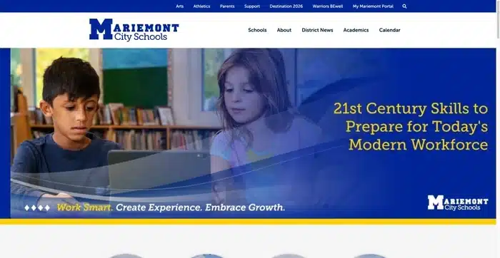
Mariemont City Schools showcases a strong brand through a cohesive use of color and design, reinforcing the district’s reputation as a Blue Ribbon School. The site features a branded calendar that allows families to easily filter events by school, and its featured videos provide a glimpse into district life, capturing the values and culture of the school community.
Key Features:
• High-quality, professional videos
• Consistent branding with blue and white colors
• User-friendly calendar with filtering options
Website: www.mariemontschools.org
Columbus Public Schools
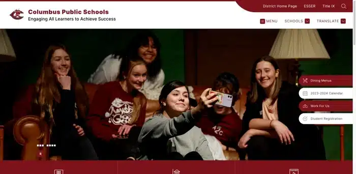
Stunning photography is the hallmark of Columbus Public Schools’ website, which immediately captivates visitors. The interactive quick links provide easy access to essential information like school calendars, staff directories, and student resources. A live feed keeps users updated on important announcements and events, ensuring that families and students stay informed.
Key Features:
• Live feed for real-time updates
• Engaging homepage photography
• Interactive quick links for easy navigation
Website: www.columbuspublicschools.org
Park Ridge-Niles School District 64
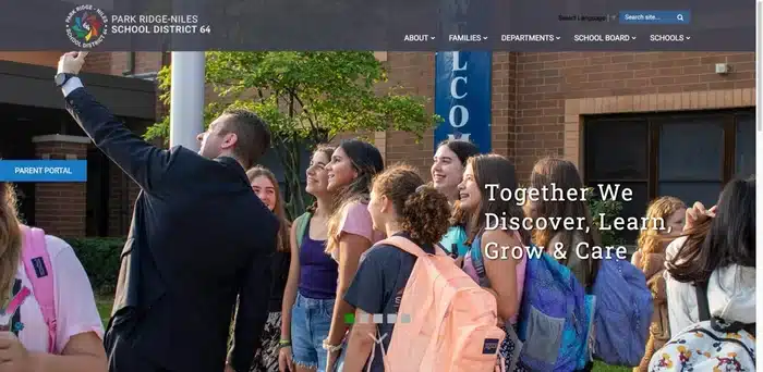
Park Ridge-Niles SD 64 uses vivid imagery to convey its commitment to education and community. The website’s well-organized navigation makes finding essential resources—like district calendars and lunch menus—easy. The news feed is another standout feature, keeping the community informed about student achievements and school projects.
Key Features:
• Engaging news feed highlighting school activities
• Visual storytelling through imagery
• Intuitive navigation and quick links
Website: www.d64.org
Hamilton High School
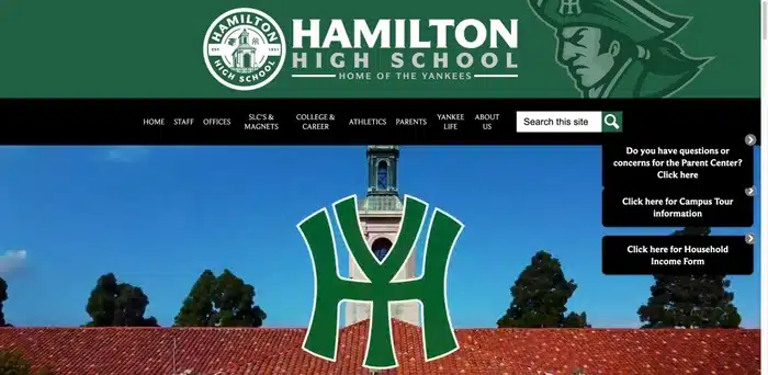
Hamilton High School’s website is a sleek reflection of its brand, with a bold green and black color scheme that’s used consistently across the site. A homepage video tour provides a comprehensive overview of the school, offering prospective students and families a virtual campus visit. The clean layout and clear menus make this site easy to navigate.
Key Features:
• Clear, easy-to-use navigation
• Striking color scheme and branding consistency
• Engaging video tour on the homepage
Website: www.hamiltonhs.org
Kirby School District 140
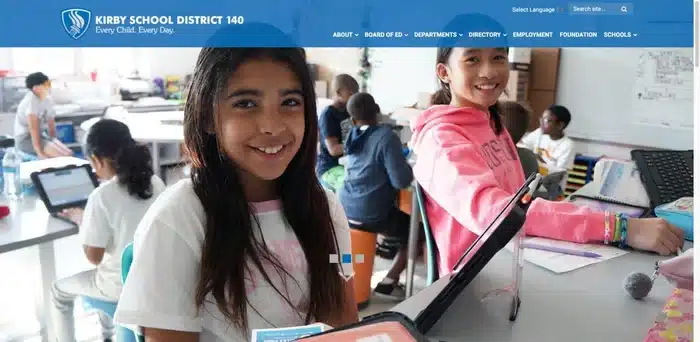
Kirby SD 140’s website excels at branding each individual school while maintaining a unified district look. The site also features live feeds for news and events, fostering a sense of community engagement. This website stands out for making it easy for families to find relevant information quickly while showcasing the unique identity of each school.
Key Features:
• Easy-to-navigate layout with clear school-specific pages
• Strong branding for each school within the district
• Live news and event feeds for real-time updates
Website: www.ksd140.org
Community Consolidated School District 59
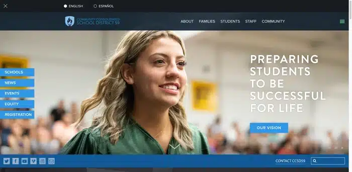
CCSD 59 has crafted a visually rich website that’s as informative as it is attractive. High-resolution images accompany well-written articles, and the site’s content truly reflects the district’s values. This site is a model for storytelling through digital platforms, with news articles and engaging visuals that highlight both school and community life.
Key Features:
• Strong focus on branding and district values
• High-quality imagery and content-rich news articles
• Easy navigation with intuitive design
Website: www.ccsd59.org
San Luis Coastal Unified School District
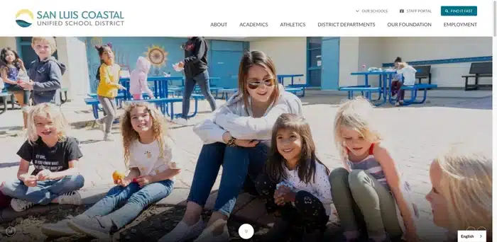
San Luis Coastal USD’s website features a clean and sophisticated design with top-notch media content. The district’s mission statement is front and center, supported by stunning imagery. The site also includes an interactive guiding principles section that informs the community about the district’s core values, along with engaging multimedia elements.
Key Features:
• Engaging multimedia, including videos and slideshows
• Sophisticated design with impactful visuals
• Interactive mission and guiding principles section
Website: www.slcusd.org
West Clermont
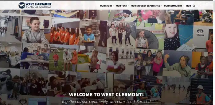
West Clermont’s website uses bold colors and a clean layout to deliver a modern, easy-to-navigate experience. The sticky call-to-action buttons on dropdown menus make it effortless for users to find what they need quickly. This website stands out for its user-friendly functionality combined with visually appealing design elements.
Key Features:
• Clear, concise navigation
• Modern design with vibrant color schemes
• Sticky call-to-action buttons for easy access
Website: www.westcler.org
Round Rock Independent School District
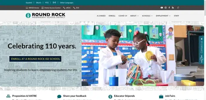
Round Rock ISD’s website strikes a balance between celebrating academic excellence and providing an inviting user experience. The A-Z index simplifies navigation, making it easy for families and students to find key information. Additionally, the site includes a language accessibility feature, ensuring that non-English-speaking families can easily access important resources.
Key Features:
• Clear focus on academic excellence and student achievement.
• Comprehensive A-Z index for easy navigation
• Language accessibility for non-English speakers
Website: www.roundrockisd.org
Lafayette Parish School System
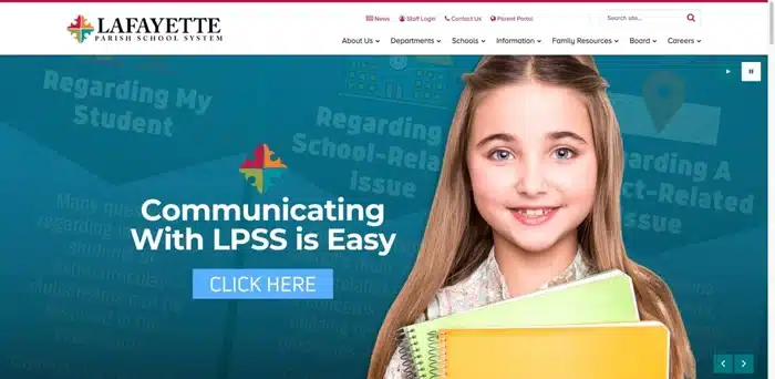
Lafayette Parish’s website uses vibrant media elements to draw users in. Dynamic dropdown menus enhance navigation, making the site intuitive and easy to use. The fun, colorful design appeals to students, families, and teachers alike, while clearly presenting the district’s mission and vision. It’s a great example of a user-friendly and engaging school district website.
Key Features:
• Clear presentation of the district’s mission and vision
• Easy-to-navigate dropdown menus
• Vibrant design and dynamic media elements
Website: www.lpssonline.com
These top 10 school district websites demonstrate how combining clear navigation, consistent branding, responsive design, and engaging multimedia can create a compelling user experience. As you plan or redesign your own district website, take note of these examples for inspiration.
Looking to elevate your school’s website design? Check out our 5 Tips for Great School Website Design for more insights.
Stay Connected
News, articles, and tips for meeting your district’s goals—delivered to your inbox.


