
Great website design starts with thoughtful planning. Before you begin, it’s essential to set clear goals for your school website. According to the National School Public Relations Association (NSPRA) and their annual awards program, award-winning websites should focus on “content clarity, appropriateness, freshness, graphic design, usability, functionality, and overall depth of information.” But what does that mean in practical terms for your school?
For instance, imagine a parent urgently looking for contact information on your website but unable to find it, leading to frustration. Or a caregiver using their phone to view your website, spending more time resizing the page than helping their child with homework. In both scenarios, poor website design hurts your school’s image and communication.
As Steve Jobs famously said, “Design is not just what it looks like and feels like. Design is how it works.” Your school’s website should not only look great but also function seamlessly to meet the needs of your stakeholders: the community, staff, families, and students.
Here are five key elements to keep in mind when designing or redesigning your school website to ensure it’s user-friendly, efficient, and engaging.
1. A “Useful” Homepage
Your homepage is your digital front door—it needs to be welcoming, intuitive, and functional. The goal of a well-designed homepage is to guide visitors quickly to the information they need with minimal scrolling or confusion.
Tips for Creating a Useful Homepage:
- Keep it Simple: Avoid overwhelming users with too much content. A clean, uncluttered homepage is easier to navigate.
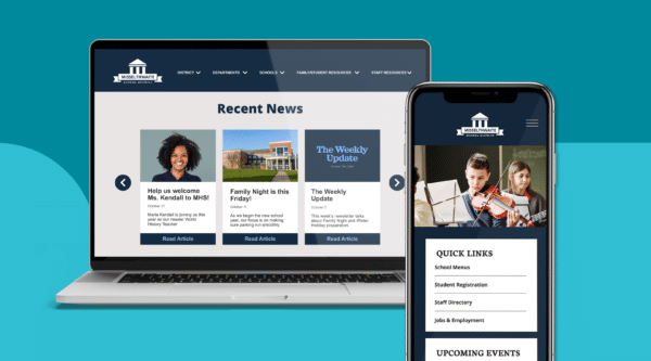
- Use Quick Links: Offer shortcuts to the most requested features. A well-placed set of quick links helps users find essential information fast. For example, the Park Ridge-Niles School District effectively uses quick links and sliders for a clean, user-friendly design.
- Highlight Important Sections: Make sure key features like the school calendar and news are easy to find and updated regularly.
- Visual Appeal: Use rotating images or sliders to keep parents informed about upcoming events, but ensure they don’t dominate the page. A content management system (CMS) can make updating these visuals simple.
A user-friendly homepage is crucial for helping visitors navigate your website with ease, making their experience both pleasant and efficient.
2. Responsive Design
Responsive design ensures that your website adapts to different devices—desktop computers, tablets, and smartphones—without sacrificing usability. Today, over half of all web traffic comes from mobile devices, meaning a mobile-friendly site is essential for reaching your audience.
Benefits of Responsive Design:
- Accessibility: Mobile users can easily navigate your website, whether they’re checking it from an email link or a social media post.
- Improved Engagement: With a responsive design, users won’t have to zoom or scroll excessively, encouraging them to spend more time on your site.
- Search Engine Optimization (SEO): Google favors mobile-friendly sites in search rankings, meaning responsive design can improve your website’s visibility.
Without responsive design, mobile visitors may quickly abandon your site, making it harder to engage them with your school’s communications.
3. Website Accessibility and ADA Compliance
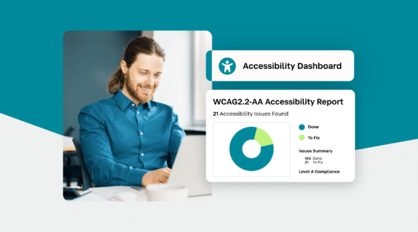
An accessible website is essential for providing equal access to all users, including those with disabilities. ADA compliance ensures that your site meets the standards set by the Web Content Accessibility Guidelines (WCAG 2.0 AA).
Key Features of an ADA-Compliant Website:
- Skip Navigation Links: Screen readers should skip repetitive navigation and jump directly to content.
- Alt Text for Images: Descriptive text helps screen readers convey the meaning of images to visually impaired users.
- Keyboard Navigation: Your website should be fully navigable using keyboard inputs alone.
- Accessible Forms and Tables: Ensure forms and data tables are structured correctly, with clear labels and headers.
Making your website accessible not only fulfills legal requirements but also ensures a better experience for all users. For more details on ensuring accessibility, see our School Website Accessibility Guide.
4. Well-Organized Navigation
Effective navigation is the backbone of a well-designed school website. The easier it is for visitors to find what they’re looking for, the more likely they are to stay and explore.
Best Practices for Organized Navigation:
- Follow the 7-Link Rule: Studies show that users can make decisions faster when presented with seven links or fewer. Organize your top-level navigation into clear, concise categories.
- Group Related Content: Group similar content together (e.g., “About Us,” “Academics,” “Student Life”) to reduce cognitive load for users.
- Sticky Menus: Consider using a sticky navigation bar that stays visible as users scroll through the page, making it easy to move between sections.
Well-structured navigation increases the chances that users will find the information they need, whether it’s contact details, the school calendar, or teacher pages.
5. Streamlined Popular Pages
Certain pages on school websites consistently attract the most traffic. Focusing on these high-traffic areas ensures that visitors can easily access the content they need without frustration.
Popular Pages to Prioritize:
- School Calendar: This is often the most visited section of a school website. Ensure it’s easy to find, up-to-date, and user-friendly.
- Contact Directory: Make it simple for parents, students, and staff to find contact information. Ensure it’s accurate and updated regularly.
- Teacher Pages: Provide direct links to teacher pages, allowing parents and students to quickly access assignments, resources, and important updates.
Review your Google Analytics to identify the most popular pages on your current website. This will help you optimize them for maximum usability.
Conclusion
A well-designed school website is much more than a collection of pretty pictures and bold colors. It’s a functional tool that enhances communication, builds community engagement, and meets the needs of diverse users.
Whether you’re designing a new website or revamping an existing one, focusing on these five key elements—creating a useful homepage, incorporating responsive design, ensuring ADA compliance, organizing intuitive navigation, and optimizing popular pages—will set you on the path to success.How does your school website measure up? If it’s not yet the “Apple” of school websites, it’s time to start planning for a redesign. For more resources on improving your school’s digital communication, visit SchoolStatus.
Stay Connected
News, articles, and tips for meeting your district’s goals—delivered to your inbox.


